Showing posts with label stairs. Show all posts

Sunday, 13 January 2013

Stairs

This weekend, I started to think about the detailing on my stairs. Feeling completely uninspired, I decided to head into the city and find some stairs to look at and sketch.

I visited the Learning Commons first and found a good place to perch and do some sketching. As well as looking at the staircase itself, I also looked closely at the details on the banisters and how the handrail attached to the glass. I also had a go at drawing how I thought it would look in section. 
Using glass for the interior staircase would work well as it would reflect the window on the other side of the stairs. It would also allow those outside the building to see into the main club space and vice versa, therefore allowing continuation between inside and outside.


I also went up to the Deansgate John Ryland's Library. The new-ish extension is full of clean lines and also has a glass banister on the staircase. I really liked the way the main staircase was clean cut without the fuss of finishings between the stairs/flooring and the banister. The floor finish also gave me some ideas for the floor finish in my own building; I wanted something that would be suitable for both inside and outside, so that it could continue from the main club space out into the landscape.



Friday, 11 January 2013

No More AutoCAD!

Having spent the best part of last week working on my drawings, I can't bear to spend another minute on AutoCAD. I have more or less finished my plans, sections and 1 out of 2 of my elevations (the first one taking my longer than the first two Lord of the Rings. Extended edition). Despite nearly loosing the will to live, I am really pleased with them so far. Actually drawing the plan has let me see exactly the size of everything and has allowed me to see whether the rooms are too big or small etc. I realised that I didn't have to add an extra space for the storage as I could just put it in the space I had for the kitchen, thus making that slightly smaller. Doing this neatens up my building as well as I don't have extra rooms added onto the main building - it is now more or less rectangular. 

Whilst playing around with my SketchUp model, I went in to Walk mode to get an idea what it would be like to actually be on my site and how you would move around it. It was then I realised that it wasn't as easy to go to the meeting rooms as it should be. It involved going down stairs then back up stairs only to go down stairs again. Or to go a really long way around. To remove this problem, I changed the layout slightly by creating a landing on the main staircase so that it was level with part of the site. I also changed the stairs inside the building to match. 

Before

After

I have started my video and by doing so, I have begun to learn how to use the animation tools on Photoshop. I currently have 7 seconds out of a maximum 2 minutes but it's getting there.

Saturday, 22 December 2012

Vertical Circulation

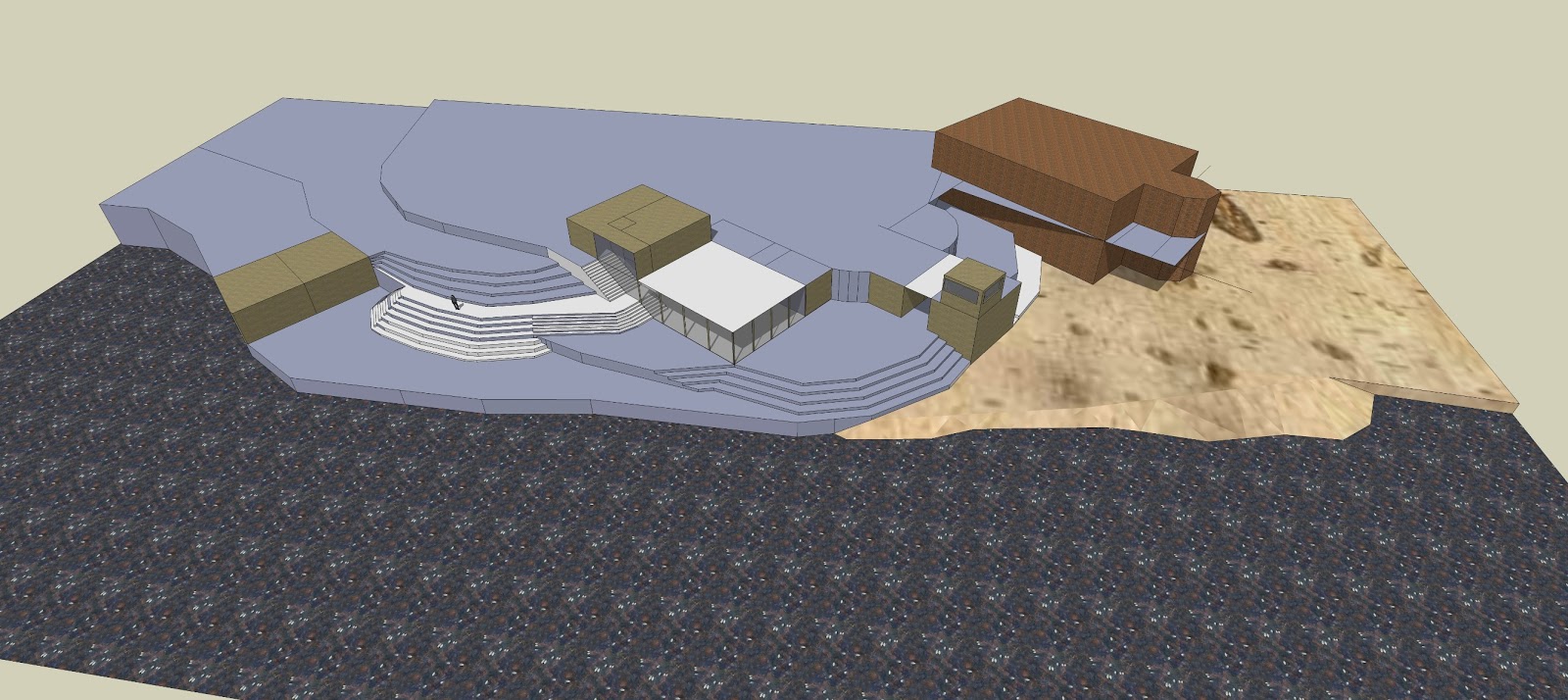
This time I really have sorted my design out and to prove it, I even built it on SketchUp  I sorted the scale of the buildings out and because they were smaller, I needed to adjust how I arranged the site. This was simply a case of levelling it out differently to fit in with the buildings. Once I had done this I then needed to work out the vertical circulation through the site. In my original concept, I wanted to create a stepped landscape in which to sit the buildings, this is to make the outside part of the centre and give it a function. I therefore wanted to split the purpose of the step into seating as well as for movement around the site. I want to make spaces that people can sit and watch the kayaking and any other events held at the centre.
Using my SketchUp model, I was able to experiment with different forms and I was able to come up with a layout/design that worked well. The main staircase on the site runs along side the staircase within the building. This is to create the link between interior and exterior. It is also the only set of stairs on the site the doesn't follow the contours of the site. There are two types of steps in my design: the usual height/depth stairs and ones which are double in dimension  These second type allow for visitors to site and watch any events. They all face towards the river as that is where my main point of focus is.

Within my design, I tried to keep the meeting rooms as separated as possible without putting a wall up around the building. I therefore have one staircase directed at that building. 

Monday, 10 December 2012

Design: Check!

 Today I have finally finalised (?) my design. Using the foam board model really helped me to get my head around the site and come up with my design.
I started designing by using card to represent the buildings and placing them on site in various places. I then built it up and the model allowed me to see how the buildings would sit in the landscape and the views available from their positioning. 
Space was still tight so I had to add extra floors to accommodate the office and race office.


The site is spilt by purpose with three buildings. Starting upstream, the first building on site are the meeting rooms. These are separate from the rest of the site to allow privacy for business meetings etc. As well as being out of the way, the rest of the site is hidden from them by the landscape and the main building. The views would be upstream and across the river, meaning that any activity happening downstream doesn't cause distraction.

The next building is the main club building. This consists of the main space, kitchen/bar and its storage, toilets and the office and reception. I began with the building below the level of the car park and having this for the main area but I still needed somewhere for the office. I came to the conclusion that it would have to go on the second storey, level with the car park but I wasn't happy with having a private space to be the first view of the building so I added a reception space to the building and would then have a staircase, mirroring the steps outside, down to the main space. The office would the site behind the reception. Due to it being on the first floor of the building, it would have views across the site, allowing staff to be able to see what is going on at the centre. I aligned the main building to have views down the river and toward the launch site for the kayaks. This focuses all the attention on that part of the site and would also add to the privacy of the business part of the site. 
My third building is the kayak storage and race centre. I positioned this to be in line with the boundary of the car park so as not to obstruct the view from the club building. This building is split into three parts: the storage, changing rooms/toilets and the race office. The storage sits on the lowest part of the site, This is so that the kayaks don't have to be carried down hill to the river. The changing rooms and toilets are located on the next level up on the site with the race office over looking that area of the site on the first floor, level with the car park.

Now that I have the design for my site, I am going to expand on it by carefully planning the interior and the vertical circulation within the main building. I am also going to start looking into materials. As the site has flooded severely in the past, and is therefore likely to do so again, I want to think about this carefully: concrete seems the best option but I don't feel like it would fit into its surroundings very well.


Wednesday, 28 November 2012

Developments and Precedents

Since I last wrote, my design has changed yet again. 

My current design, the one I'm going to roll with, involves not putting a staircase inside the building but by putting buildings within a stepped landscape. I got my inspiration from somewhere I visited on holiday in Cornwall years and years ago. 
The Minack Theatre, Cornwall

The Minack Theatre was build by Rowena Cade as a place to perform plays that she organised. Set on the cliff top, it makes the most of the topography. Its use of the landscape in which it sits is the reason I chose it as a precedent. 
Our site is steep and I want to make use of that to create an outdoor space that looks out onto the River Severn and the activities on it. 
I began developing my design by working in plan and looking at where my building would be placed and how the whole site would be arranged. 
The Minack Theatre has steps that provide the seating for the theatre as well as access through the site. I want to incorporate this idea into my site but I also want to create flat spaces which provide extensions to the main club space and spaces for activities.
To help me to design the layout of my site, I looked at precedents of visitor centres. Searching on ArchDaily provided me with Orokonui Ecosanctuary Visitor Centre in New Zealand. 
I colour-coded the different types of spaces and marked them on the plan: blue for public, red for semi-public, yellow for private and green for facilities. From this, I was able to see how buildings of a similar purpose were arranged. I noticed that the public spaces were the most central within the building and everything that needed to be reached by the visitors came off this central space. The facilities were more hidden but were still easily accessible while the private spaces were completely set back from the main space, with access hidden on a kind of need to know basis.

I am going to use these precedent to help develop my idea into a cohesive design over the next week and I plan on having my design sorted before Christmas - want to actually have something akin to a holiday this year!